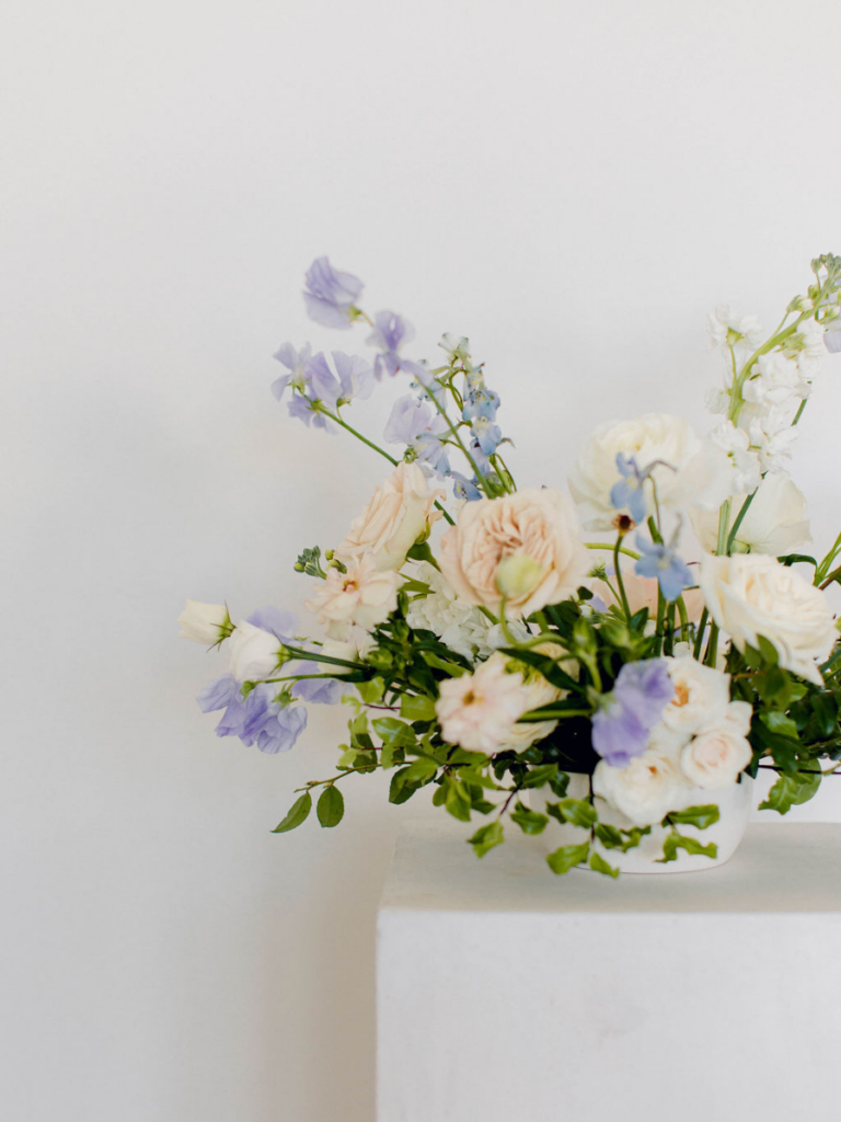
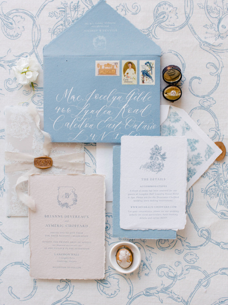
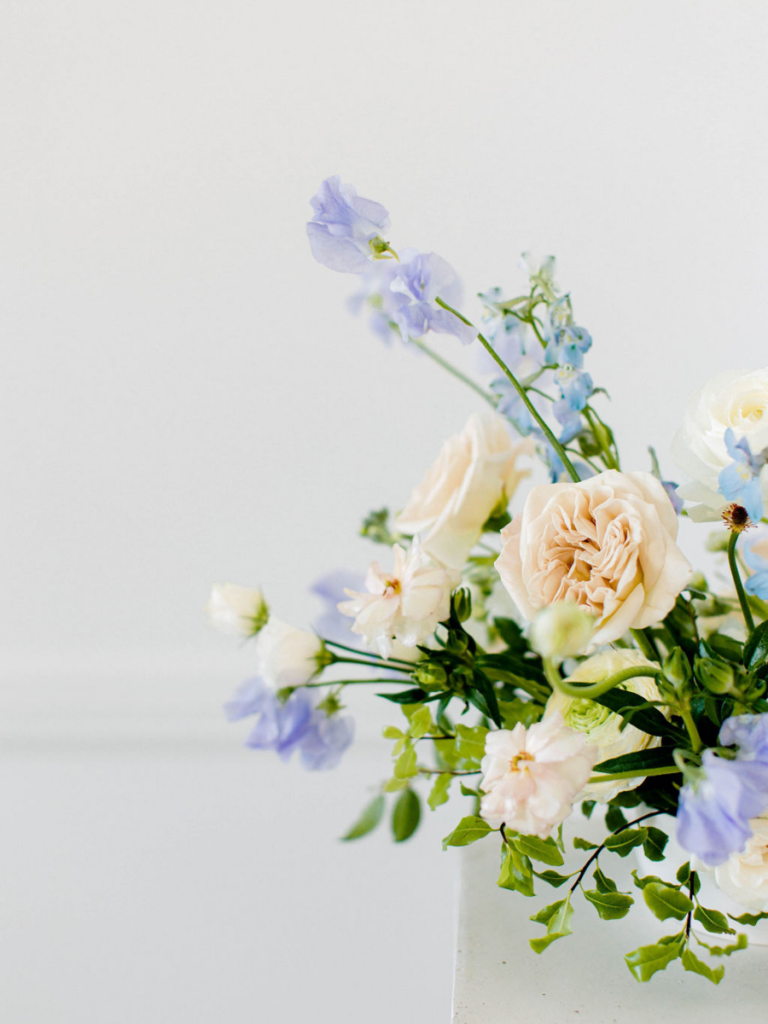
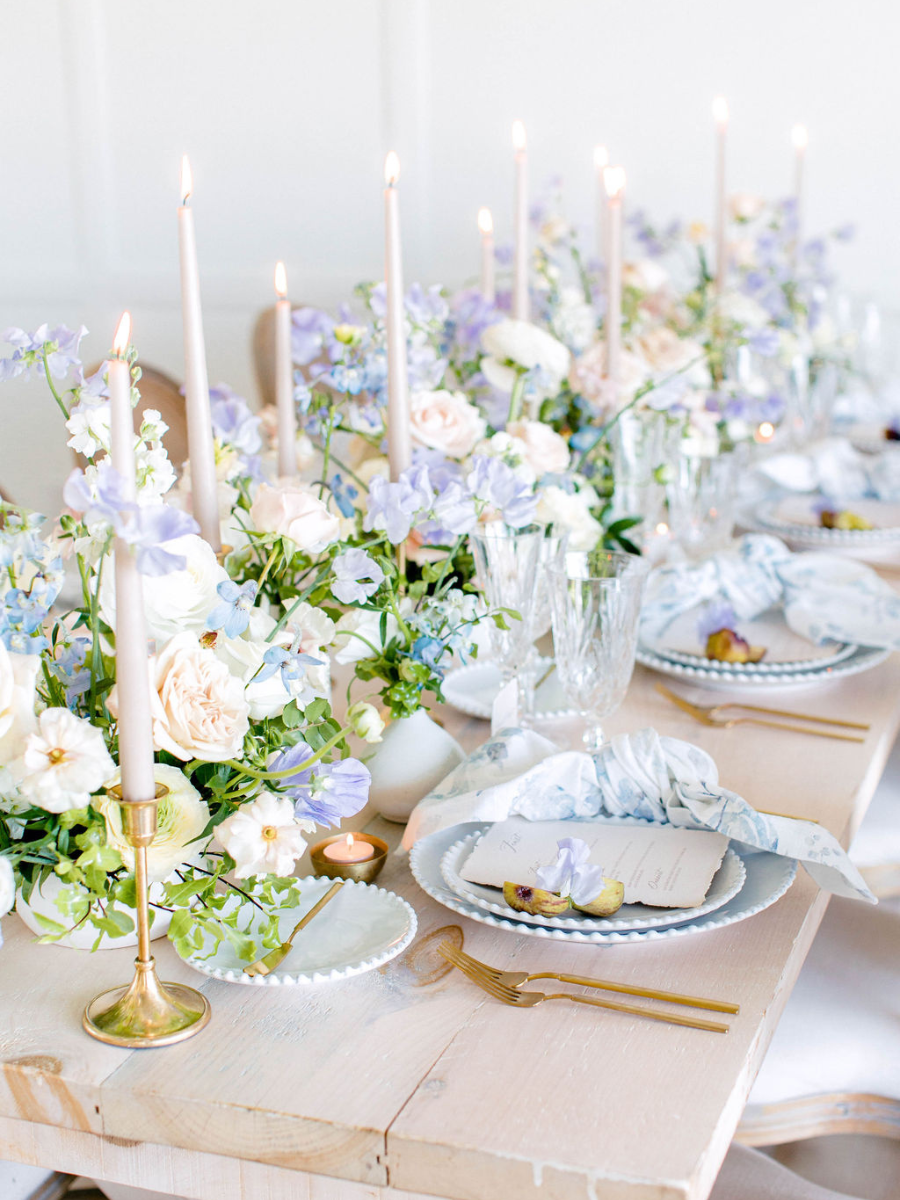
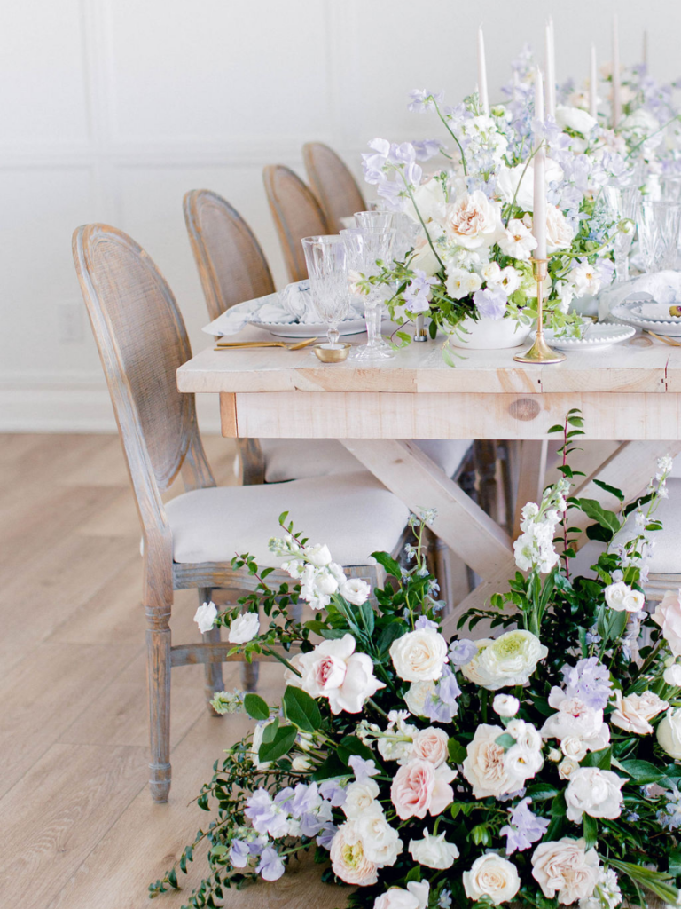
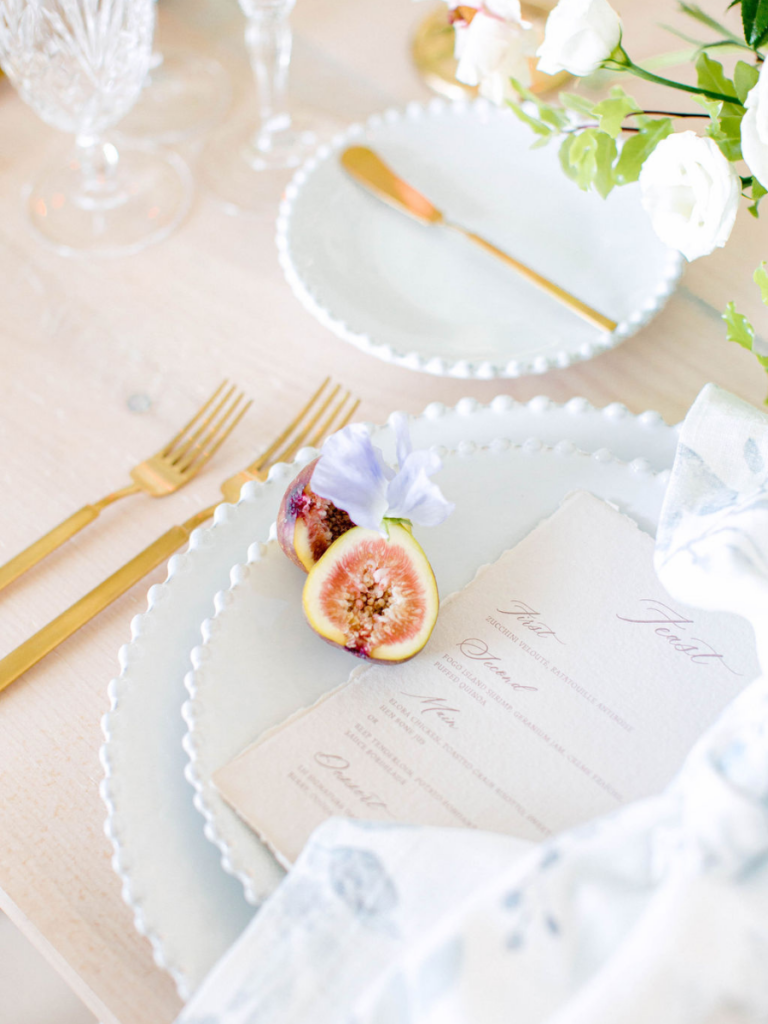
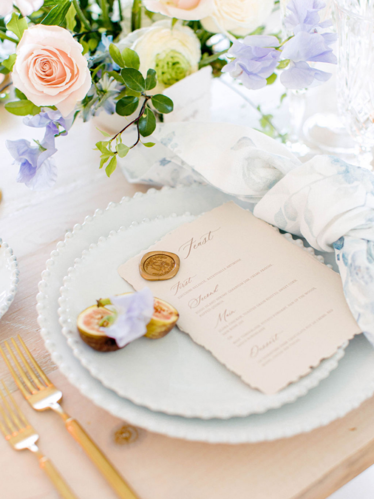
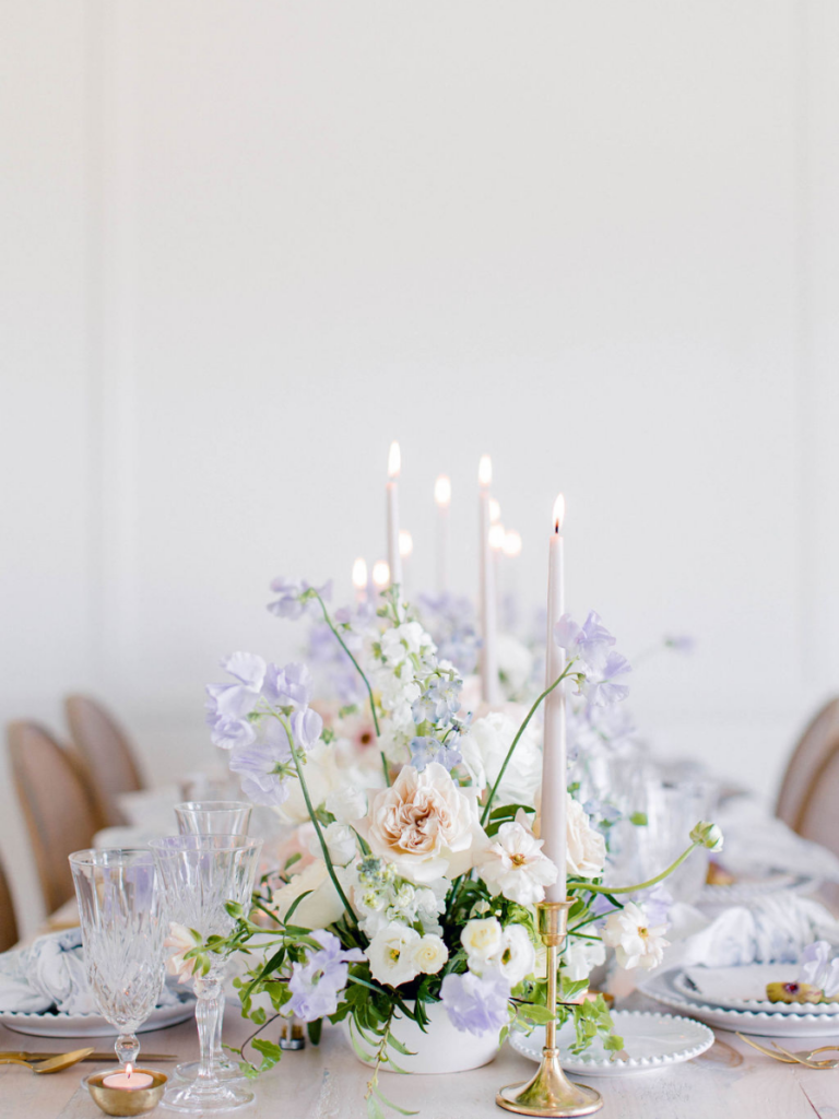
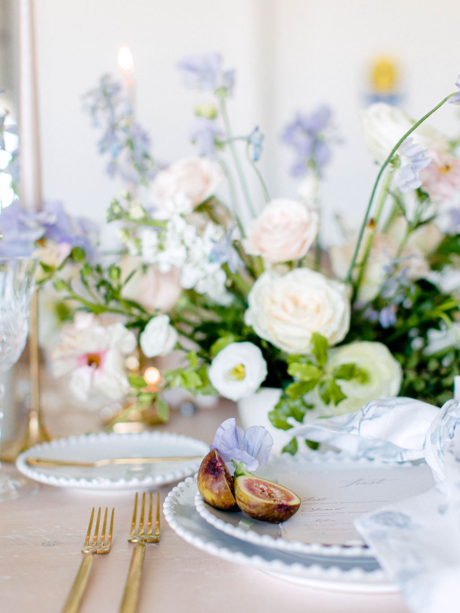
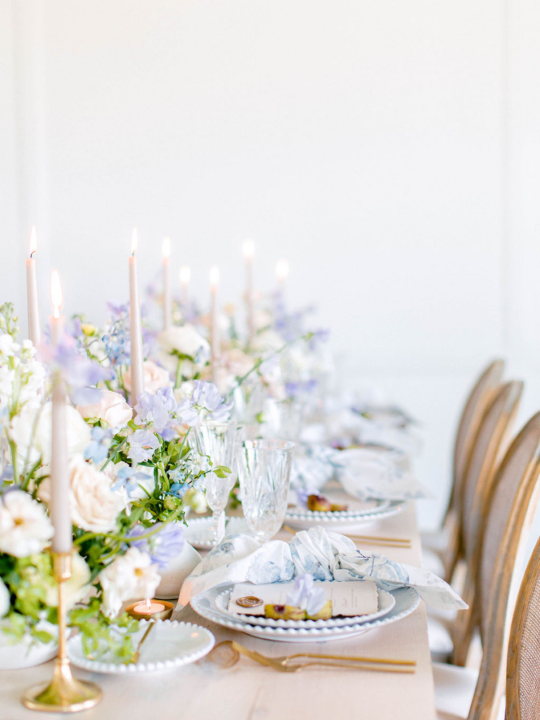
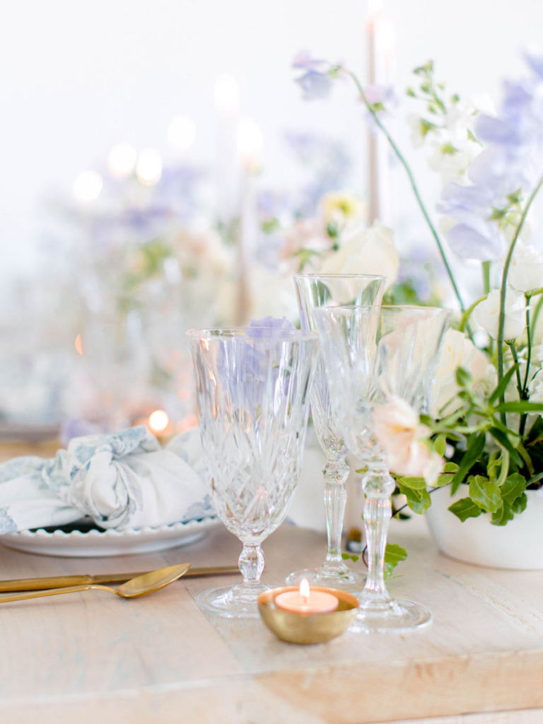
This romantic and colourful branding shoot for Beth Jacobs Wedding & Events had us playing with flowers that are soft neutrals, with a beautiful pop of colour. Shot by JLP Studio at Simply Beautiful Decor’s studio, the goal was to create a look that reflected Beth’s updated branding and new website. Beth planned and styled all of the wonderful details together. I always chuckle and admire her on-site styling kit that she brings to every wedding. It’s an amazing curated collection of pretty details!
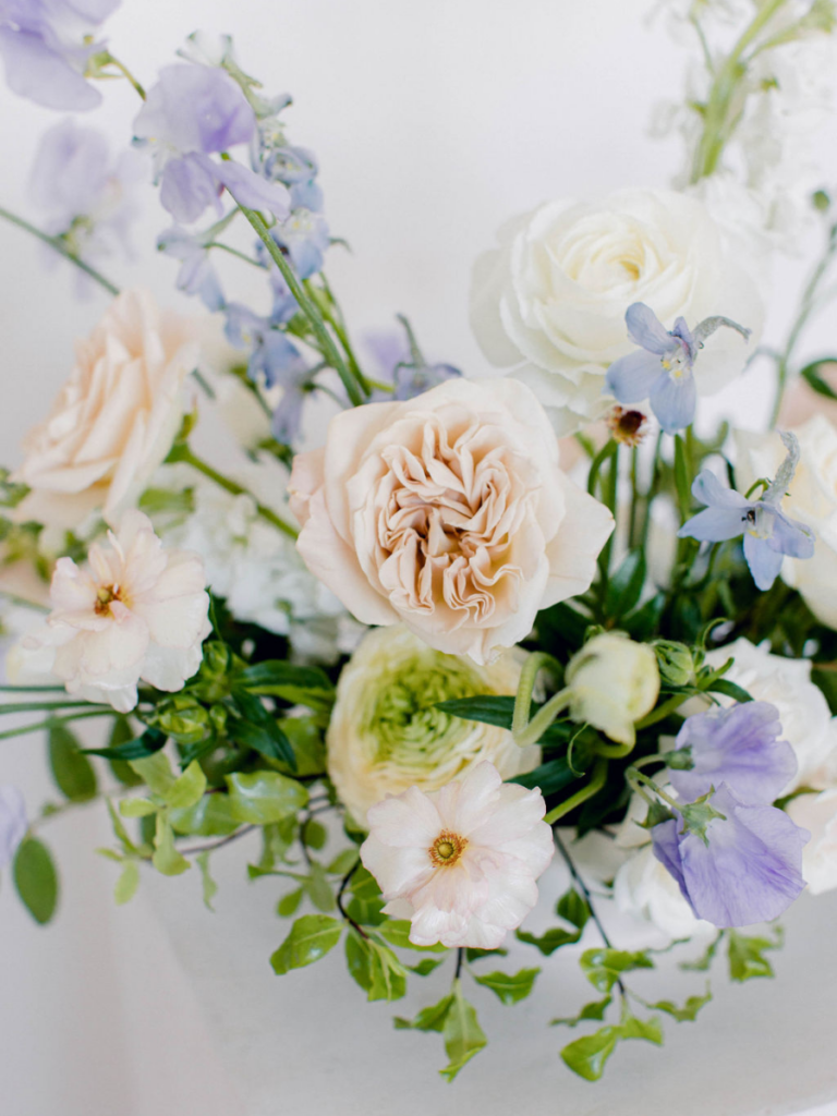
The Romantic Flowers
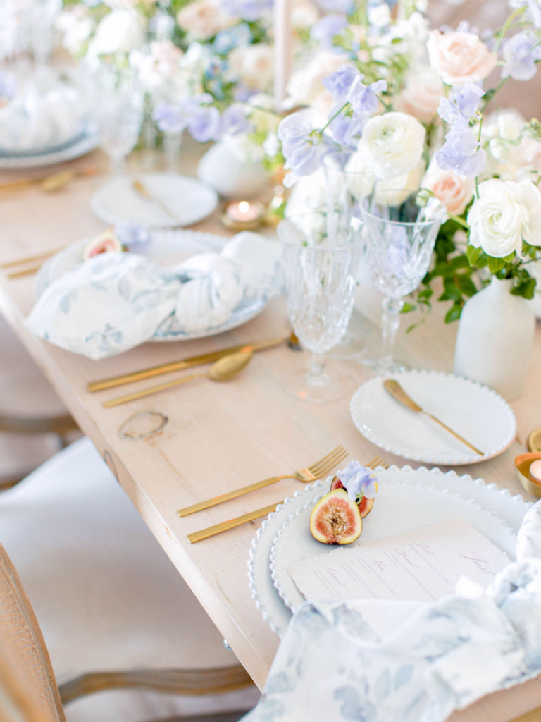
Would you believe us if we told you the pops of purple florals weren’t in the original design? Initially, we had ordered white sweet pea, but to our surprise we were given this stunning lilac purple instead. These were honestly some of the longest stemmed sweet pea we had ever seen and we loved incorporating them into the colour palette. The accents of blue and purple florals add a lively and fun aspect to the more traditional white and blush colour palette. A truely happy accident!
Transforming the Look
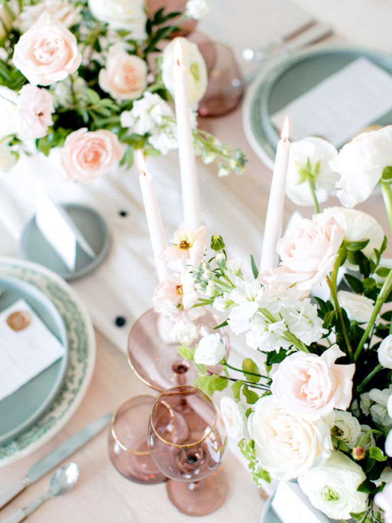
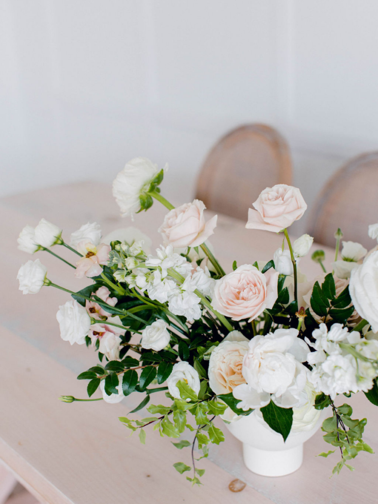
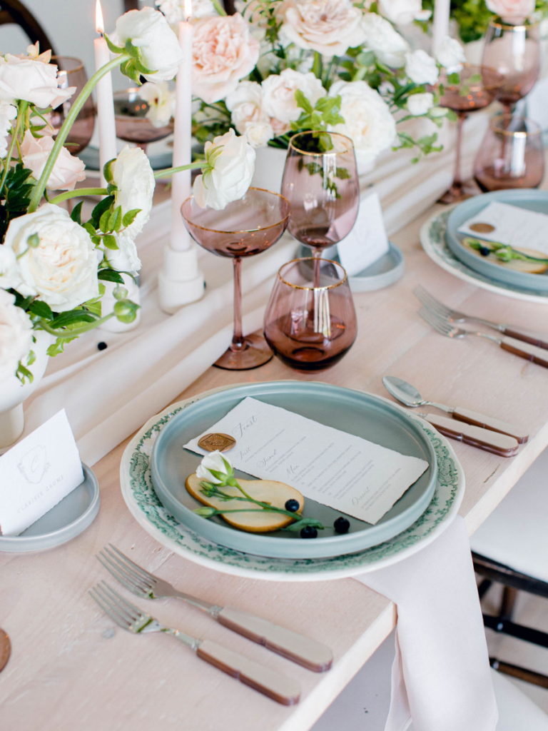
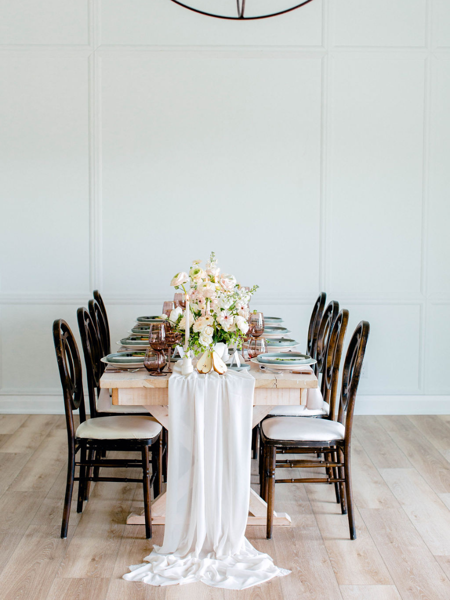
When considering your own branding shoot, think of how you can create at least two looks in the one day. Ask your florist how they same arrangements or flower order can be utilized to create another look. This will maximize your budget and give you more content to work with. For Beth’s branding shoot, we utilized the rest of her flower order to create a few additional arrangements, but then we also removed the purple and blue flowers to have a classic white and blush flower palette for a second tablescape. Just like that we transformed one colour palette to another to have a whole different vibe! Coupled with dinnerware and glassware from Simply Beautiful Decor, you have a completely elevated and romantic tablescape. This new look is equally is gorgeous as the last!
The Vendors
Venue: Simply Beautiful Decor
Photography: JLP Studio
Planner & Design: Beth Jacobs Weddings & Events
Flowers: Forever Wildfield